
You could spend hours staring at a spreadsheet of internal link data and still not understand how your site's architecture is actually working. A visual link map changes that in seconds. Isolated clusters become obvious. Orphan pages appear as disconnected dots. Pages that should be well-linked sit visually peripheral when they should be central.
This guide covers how to create a visual map of your site's internal link structure, using both free tools (with step-by-step instructions) and paid options, and explains what to look for once you have the visualisation in front of you.
Definition
Internal link visualisation is the process of representing a website's internal link structure as a graph or diagram, where nodes represent pages and edges represent hyperlinks between them. The resulting graph shows how link equity flows, which pages are central or peripheral, and which content sits in isolated clusters or has no connections at all.
Why Visualise Internal Links?
Raw crawl data tells you what exists. Visualisation tells you what it means. A site with 500,000 internal links produces a data export that no human can review row by row. But the same data rendered as a graph shows structural patterns immediately: hub pages, orphaned clusters, topic silos that have no connections to each other, and content that sits four or five levels deep when it should be near the surface.
9x
more organic traffic for pages within 3 clicks of the homepage vs deeper pages
Source: inblog.ai
Vincent Malischewski, an SEO and data expert who previously worked at DotdashMeredith, makes the case succinctly: "Visualising link equity is incredibly helpful for stakeholders. A graph makes the abstract concrete, whether you are trying to understand content clusters or justify a site restructure to a non-technical team."[1]
Beyond stakeholder communication, visualisation supports three specific SEO tasks:
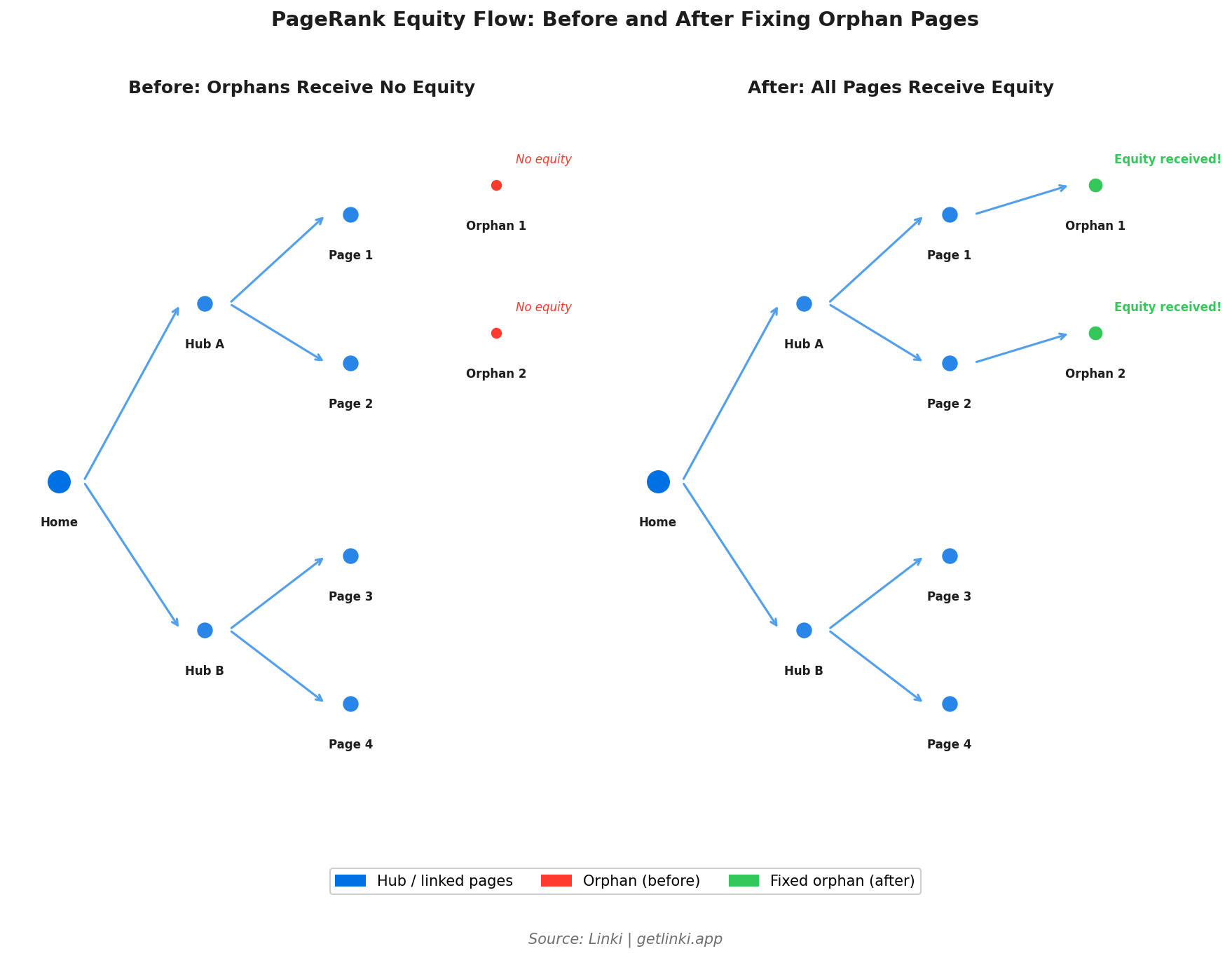
- Orphan page discovery: Nodes with no edges are your orphan pages. Fixing them starts with seeing them.
- Crawl depth analysis: Visualise the graph by depth level to see how far key content sits from the homepage.
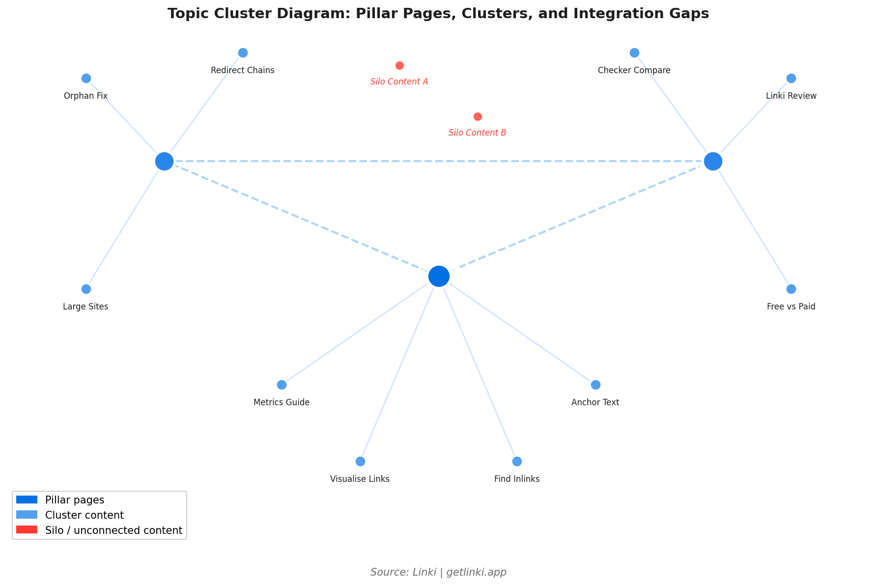
- Topic cluster integrity: Check whether related content pages link to each other, or whether your clusters exist in the CMS but not in the actual link graph.
"Connecting orphaned pages to the rest of a site's structure has produced documented traffic increases of 106% in some cases. Visualisation is often the first step to finding them."
Google Penalty analysis, orphan page case studies
Free Tools: Screaming Frog Visualisation
Screaming Frog includes built-in visualisation features that work without additional software. Here is the step-by-step process:
Step 1: Run your crawl. Open Screaming Frog, enter your domain, and run a full crawl. For sites above 500 URLs, you need the paid version (£199/year).
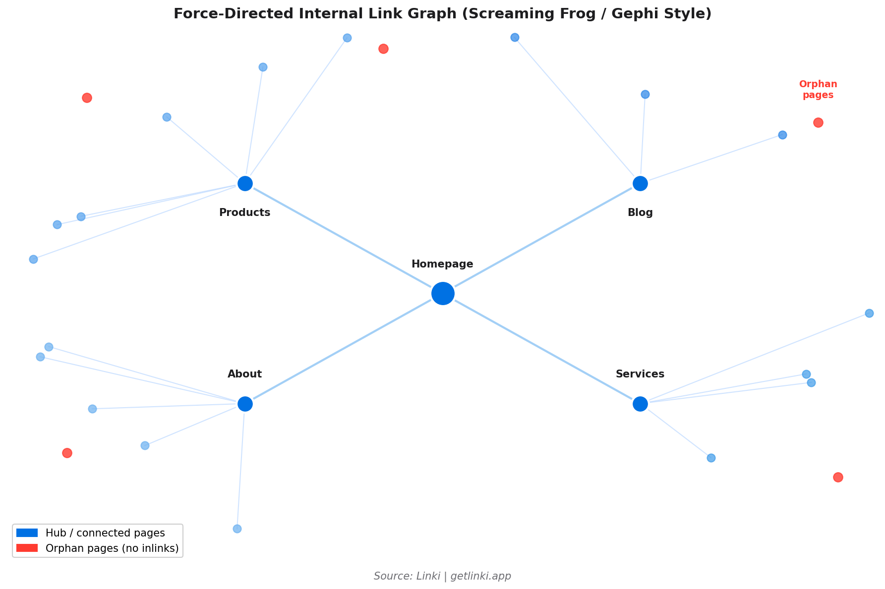
Step 2: Access the visualisation. Go to Crawl Analysis > View Crawl Diagrams. Screaming Frog renders a force-directed graph showing the link relationships between pages. Each node is a URL; each edge is an internal link.
Step 3: Configure the view. You can filter by depth (showing only pages at a specific click level), by status code (highlighting broken links), or by inlink count (visualising which pages are most and least linked). Colour coding by category or template type makes it easier to spot structural patterns.
Step 4: Identify issues. Look for isolated nodes (orphans), nodes at the periphery of the graph (deep pages), and areas where the graph is dense on one side but sparse on another (uneven equity distribution). Export the diagram or take screenshots for reporting.
Free Tools: Gephi for Advanced Visualisation
Gephi is a free, open-source graph visualisation tool that produces publication-quality link maps from Screaming Frog data. The learning curve is steeper than Screaming Frog's built-in diagrams, but the output is far more customisable and informative for large sites.
Step 1: Export from Screaming Frog. Go to Bulk Export > All Outlinks. This exports a CSV with source URL, destination URL, and metadata. Filter the export to internal links only (exclude external links).
Step 2: Prepare the data. Open the CSV in a spreadsheet application. You need two columns: Source and Target. Each row represents one internal link (one edge in the graph). Save as CSV.
Step 3: Import to Gephi. Open Gephi. File > Import Spreadsheet. Select your edge file. Choose "Directed" graph (internal links have direction: from linking page to linked page). Gephi imports the nodes and edges automatically.
Step 4: Apply a layout. ForceAtlas2 is the most popular layout algorithm for website link graphs. It clusters well-connected pages together and places peripheral pages at the edges. Run it until the graph stabilises (usually 30-60 seconds). You can also try Yifan Hu for larger graphs.
Step 5: Add metrics. Run Gephi's built-in statistics: degree (in and out), betweenness centrality, and modularity (for cluster detection). Size nodes by in-degree to make highly-linked pages visually dominant. Colour nodes by modularity class to show topic clusters.
Step 6: Identify issues. Nodes with no edges are orphans. Nodes in isolated modularity clusters that should connect to others are silos. Nodes at the periphery of a radial layout are deep pages.
Paid Tools
SEO PowerSuite Website Auditor
SEO PowerSuite's Website Auditor provides interactive site visualisation showing internal link flow, orphan pages, and PageRank distribution. It renders a clickable site map where each node shows the page's estimated PageRank and inlink count on hover. For teams that need client-ready reports without Gephi's technical setup, this is a more accessible option.[2]
Sitebulb
Sitebulb's visualisation is one of the most polished in the industry. It renders a hierarchical tree diagram and a force-directed graph simultaneously, allows filtering by status code, depth, and page type, and includes a dedicated orphan pages view. The visualisation updates in real-time as you apply filters, making it efficient for navigating large site architectures.
Linki: Automated Visual Analysis
Linki is building towards automated, interactive link visualisation that does not require manual export-and-import workflows. Where Gephi requires a Screaming Frog export, a data preparation step, and a graph rendering process, Linki aims to produce an equivalent visualisation from a single domain input.
For teams without technical SEO skills who need to understand their site's link structure quickly, this removes the main barrier to using graph visualisation as a routine audit tool rather than an occasional deep-dive exercise. Sign up for early access to Linki to be notified when the visualisation features launch.
Spotting Issues in Link Graphs
Knowing what to look for in a visualisation is half the value. Here are the four most important patterns to identify:
Orphan Pages
Visually: isolated nodes with no incoming edges. In Gephi: nodes with an in-degree of zero. In Screaming Frog: nodes that appear floating away from the main graph body.
Fix: identify the most topically relevant existing page for each orphan and add a contextual internal link. Prioritise orphans targeting keywords with search volume.
Deep Pages
Visually: nodes at the very periphery of the graph, connected by long chains. In depth-coloured views: nodes at depth 4+. Pages at depth 1-3 receive nine times more organic traffic than those deeper in the architecture.[3]
Fix: add links from hub pages or add intermediate hub pages to reduce click depth for priority content.
Disconnected Clusters
Visually: groups of well-connected nodes that have no edges to other groups. In modularity analysis: high-modularity sections that should be part of a broader topic cluster but are not connected to it.
Fix: identify the natural connection points between clusters and add contextual links. Usually a pillar content page that links to both clusters resolves this.
Unbalanced Equity Distribution
Visually: one part of the graph is dense (many links, many connections) while another is sparse. In size-by-in-degree views: a few pages are very large while most are tiny.
Fix: redistribute equity by adding links from over-served pages to under-served priority pages. Also check whether high-traffic pages are sending equity to the right destinations.
5%
organic traffic uplift from adding footer internal links to key pages
Source: SearchPilot controlled experiment
Optimising with Linki
Visual audits are most valuable when they inform specific actions. Linki combines visual representation with prioritised recommendations, so the output of a visualisation session translates directly into a fix list rather than a general sense that "something needs improving."
Key capabilities in development:
- Force-directed link graph with colour coding by crawl depth, status, and page type.
- Orphan page detection with automatic suggestions for donor pages (pages likely to be topically relevant).
- Topic cluster view: see which content groups are well-integrated and which are siloed.
- Before/after comparison: re-run analysis after fixes to confirm structural improvements are reflected in the graph.
For the audit workflow that pairs with visual analysis, see our guide to auditing internal links at scale. For the metrics that make visual analysis actionable, see internal linking metrics that actually matter.
Frequently Asked Questions
How do I create a visual map of my site's internal links?
The fastest free method: run a Screaming Frog crawl and use the built-in Crawl Diagrams view (Crawl Analysis > View Crawl Diagrams). For more detailed analysis on larger sites, export the internal links CSV from Screaming Frog and import it into Gephi as a directed graph. Apply the ForceAtlas2 layout and size nodes by in-degree to see the equity distribution pattern. Paid tools like Sitebulb and SEO PowerSuite Website Auditor also offer polished built-in visualisations.
What tools visualise orphan pages and link flow?
Screaming Frog (free for under 500 URLs), Gephi (free, manual data import), Sitebulb (paid, cloud), SEO PowerSuite Website Auditor (paid), and Linki (free beta, automated) all visualise orphan pages. In graph terms, orphans appear as isolated nodes with no incoming edges. In Ahrefs Site Audit, they appear in the "Pages with no incoming internal links" report rather than a visual interface.
Why visualise internal structure for SEO?
Visual maps reveal structural patterns that spreadsheets hide. Orphan pages, disconnected topic clusters, and poorly distributed link equity are immediately obvious in a graph view, while they require extensive manual filtering to find in a CSV export. Visualisation also makes it much easier to communicate structural issues to non-technical stakeholders like managers or clients.
How do I fix issues spotted in link graphs, such as deep pages?
For deep pages (4+ clicks from the homepage): add links from hub pages or category pages to the deep content, add a related posts section to pages near the top of the architecture, or create an intermediate hub page that links to multiple deep pages in the same topic area. For orphan pages: identify the most relevant existing page and add a contextual link. For disconnected clusters: find the natural connection point (usually the pillar page for each cluster) and add bidirectional links.
How often should I re-visualise my site's link structure?
For actively publishing sites, a quarterly visual audit is sensible. The graph evolves as new content is added, and structural problems (new orphans, growing clusters without cross-links) accumulate over time. After any major site restructure, CMS migration, or content category addition, a visualisation check should be one of the first post-change tasks.
Sources
- Vincent Malischewski, Visualising website structure with Gephi
- SEO PowerSuite, Site visualisations in Website Auditor
- inblog.ai, How many internal links per page for SEO?
- SearchPilot, Impact of internal linking on SEO
- Zyppy, Zyppy SEO study
- Google Penalty, Risks of orphan pages
- IMG Courses, Internal link mapping
- Ahrefs, Technical SEO audit guide
- Semrush, Semrush site audit thematic reports